Article
Design·13 min read·
Color Theory for Web Designers: HEX, RGB, HSL & Picking Colors That Work
Bad color choices kill good designs. Learn how HEX, RGB, and HSL color systems work, how to build harmonious palettes, and common mistakes that make sites look unprofessional.
SimpleWebToolsBox Team
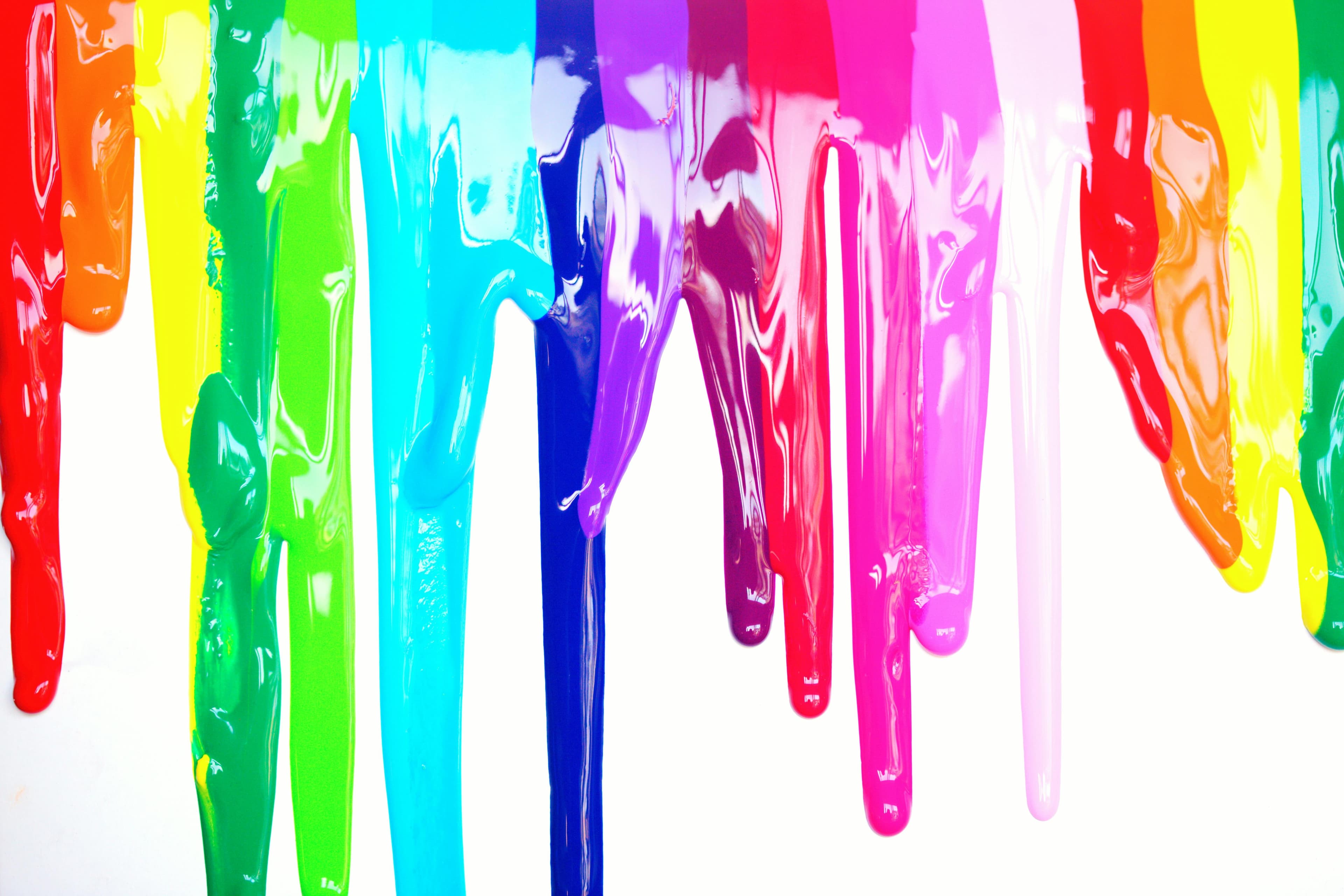
Table of Contents
Why Color Is the Hardest "Simple" Design Decision
Ask a non-designer to describe a bad website and they will almost never say "the layout was wrong" or "the typography was off." They will say it looked ugly, unprofessional, or hard to read — and most of the time, color is the culprit. A jarring color combination, a background that fights with text, or a button that disappears into a page all signal to users — before they read a single word — that something is not right.
Color is simultaneously the most immediately visible design choice and the least understood. Most developers pick colors by instinct or copy hex codes from other sites. This guide builds a working understanding of how color actually functions — the science behind the systems, the mathematics of harmony, and the practical rules that separate polished interfaces from amateurish ones.
Understanding the Three Color Systems
Before choosing any colors, you need to understand how CSS represents them. There are three systems you will encounter constantly.
HEX
Hexadecimal color codes are the format you see most often in CSS: #FF5733, #2C3E50, #FFFFFF. Each pair of characters represents the red, green, and blue channels on a scale from 00 (0) to FF (255) in base-16 notation.
#FF5733 breaks down as:
FF= 255 red (maximum)57= 87 green33= 51 blue
HEX is compact and copy-pasteable, which is why designers use it for handoff. Its weakness is that it is completely opaque to human intuition — you cannot look at #3B82F6 and immediately know it is a medium blue without checking.
HEX also cannot natively express transparency. For that, you use an 8-character HEX: #3B82F680 where the last two characters represent opacity (80 in hex = 50% opacity).
RGB and RGBA
RGB expresses the same three channels as decimal values: rgb(255, 87, 51). This is slightly more readable but still not intuitive for understanding or adjusting colors.
The advantage of RGBA is explicit alpha (transparency) support: rgba(59, 130, 246, 0.5) — that last value ranges from 0 (fully transparent) to 1 (fully opaque). This is the format to use whenever you need semi-transparent colors in CSS.
HSL (Hue, Saturation, Lightness)
HSL is the format that actually makes sense to human eyes: hsl(210, 89%, 60%).
- Hue — the color itself, expressed as a degree on a color wheel (0/360 = red, 120 = green, 240 = blue).
- Saturation — how vivid or washed-out the color is (0% = grey, 100% = fully saturated).
- Lightness — how light or dark the color is (0% = black, 100% = white, 50% = the "pure" color).
Why does this matter? Because HSL lets you create color variations systematically. To make a color lighter, increase the L value. To desaturate it, lower the S value. To find an analogous color, adjust the H value slightly. You cannot do any of this intuitively in HEX.
In modern CSS, hsl() and oklch() (a more perceptually uniform successor) are increasingly the professional choice for building design systems with consistent color scales.
The Color Wheel and Harmony
Color harmony is not a matter of personal taste — it follows mathematical relationships between colors on the wheel. Understanding these relationships lets you generate palettes that feel balanced rather than arbitrary.
Complementary Colors
Colors directly opposite each other on the wheel (180° apart). Examples: blue and orange, red and green, purple and yellow.
Complementary pairs create maximum contrast and visual energy. They work brilliantly for CTAs (call-to-action buttons on a complementary background) but can feel jarring if used at equal weight across a layout. The common pattern: use one color as the dominant background/brand color and its complement sparingly as an accent.
Analogous Colors
Colors adjacent to each other on the wheel (30–60° apart). Examples: blue, blue-purple, and purple; or yellow, yellow-green, and green.
Analogous palettes feel cohesive and natural. They are widely used in product interfaces because they are easy to live with across many screens. The challenge is creating sufficient contrast between elements — with similar colors, hierarchy depends more on lightness and saturation differences than on hue.
Triadic Colors
Three colors evenly spaced 120° apart on the wheel. Example: red, yellow, and blue; or orange, green, and violet.
Triadic palettes are vibrant but require careful balance. Typically, one color dominates (60%), one supports (30%), and one accents (10%).
Split-Complementary
A variation on complementary: take a color and use the two colors on either side of its complement. Example: blue with red-orange and yellow-orange.
This gives the visual tension of a complementary palette without the harshness of direct opposition. It is one of the most practical harmony approaches for web interfaces.
Monochromatic
Multiple shades and tints of a single hue. Different values of lightness and saturation create a palette that is cohesive almost by definition. The risk is looking flat — strong contrast between lightness values is essential.
Contrast: The Rule That Cannot Be Broken
Harmony is a matter of aesthetics. Contrast is a matter of accessibility and legibility — and it has specific, measurable standards.
The Web Content Accessibility Guidelines (WCAG) define minimum contrast ratios:
| Content Type | Minimum (AA) | Enhanced (AAA) |
|---|---|---|
| Normal body text | 4.5:1 | 7:1 |
| Large text (18pt+ or 14pt bold+) | 3:1 | 4.5:1 |
| UI components and icons | 3:1 | — |
Contrast ratio compares the relative luminance of two colors. #FFFFFF white on #000000 black is 21:1 — the maximum. Medium grey on white is often below 3:1, which fails for body text.
Why does this matter? Approximately 8% of males and 0.5% of females have some form of color vision deficiency (color blindness). Low-contrast text is additionally difficult for anyone reading in bright sunlight, on a low-quality screen, or as they age. Accessibility is not a niche concern — it directly affects a large portion of your users.
Practical rule: never put text on a background without checking the contrast ratio first. Online contrast checkers and browser DevTools both include this calculation.
Building a Color Palette for a Web Project
A functional web color palette typically contains five to seven defined colors covering these roles:
Primary Color
Your brand color. The color that appears on primary buttons, key headings, active navigation states, and other critical interactive elements. Users will associate this color with your brand, so choose it with care.
Secondary Color
A supporting color for less-critical buttons, secondary labels, or decorative elements. It should harmonize with the primary without competing with it.
Neutral Scale
A range of greys (or very slightly tinted greys) from near-white to near-black. These form the backbone of your layout: backgrounds, borders, text at different hierarchy levels, dividers. Most interfaces use 8–10 steps in their neutral scale.
If you want a more sophisticated feel than pure grey, use a very slightly desaturated version of your primary hue for the neutral scale. This creates subtle chromatic harmony throughout the interface.
Semantic Colors
Colors that carry universal meaning:
- Success / positive: green (typically)
- Warning / caution: amber or yellow
- Error / danger: red
- Informational: blue
Do not override these with brand colors. If your primary brand color happens to be red, you still need a distinct semantic red for error states — otherwise users cannot distinguish "your brand" from "this action failed."
Surface and Background
Define your primary background color explicitly. Most interfaces use off-white (#F8FAFC, #F9FAFB) rather than pure white (#FFFFFF) for the main background — pure white can cause eye strain and makes the UI feel stark.
Practical Color Mistakes to Avoid
Using Colors Straight from the Picker at Full Saturation
Colors at maximum saturation (HSL 100%) look like highlighters on screen. Real-world design almost always uses colors between 40–90% saturation, depending on the lightness. Fully saturated colors are appropriate for small accents, not backgrounds or large text areas.
Not Defining a Color System Before Building
Picking colors ad-hoc as you build creates inconsistency — slightly different shades of the same blue appearing across components because each was chosen independently. Define your palette first. Use CSS custom properties (--color-primary, --color-surface, etc.) to enforce it.
Choosing Colors Only on Your Monitor
Professional monitors are color-calibrated. Most users are not viewing your site on professional monitors. Check your design on multiple devices and screens, especially phones. Colors shift between displays.
Ignoring Dark Mode
More than 80% of smartphone users use dark mode at least some of the time. A design that only defines colors for a light background will either break in dark mode or look unintentionally harsh (white text on a dark background with light-mode shadows and borders still visible).
Using Pure Black for Text
#000000 on #FFFFFF is the maximum possible contrast — which actually looks harsh and is tiring to read for extended periods. Professional interfaces use near-blacks: #111827, #1F2937, or similarly dark values with a slight hue. The contrast is still excellent but less visually fatiguing.
Working with Color Tools
Converting Between Formats
You will frequently need to convert between HEX, RGB, and HSL — when pulling a color from a design tool that outputs HEX and needing it in HSL for programmatic manipulation, for example.
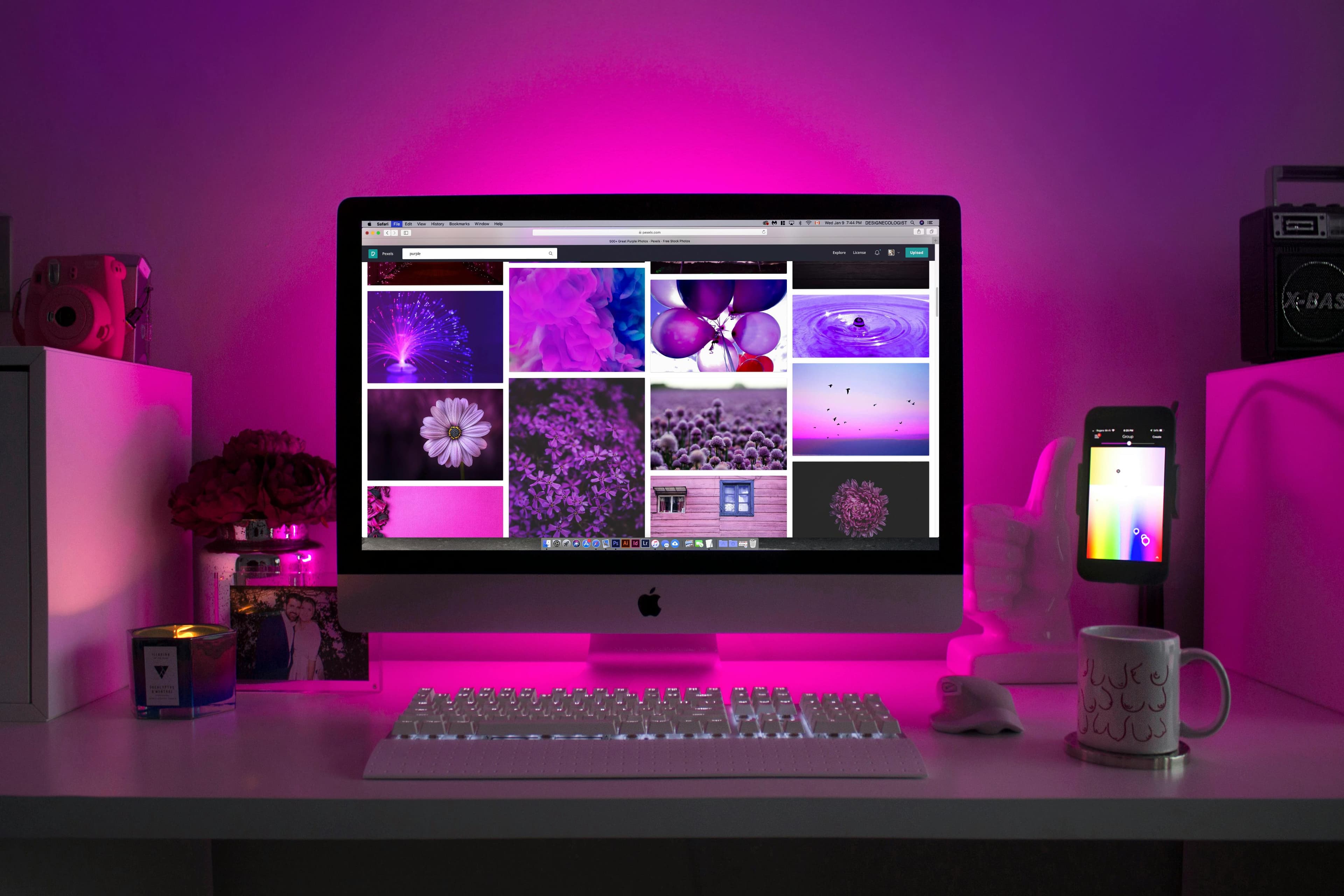
SimpleWebToolsBox offers a free Color Picker and converter that shows all three format values simultaneously for any color you choose. Pick a color visually, and instantly see its HEX, RGB, and HSL equivalents to copy into your code.
Checking Contrast
Before finalizing any text/background combination, check the contrast ratio. This can be done in browser DevTools (Inspect Element → Styles → click the color swatch → contrast ratio appears) or in a dedicated tool.
Generating Palettes
For generating tint/shade scales, tools like Tailwind CSS's color palette generator or the Material Design palette tool produce a range of lightness values from a single base color — giving you the 50/100/200/.../900 scale that most design systems use.
A Starting Palette Template
If you are building a new project and need a starting point:
:root {
  /* Primary (example: blue) */
  --color-primary-50:  hsl(214, 100%, 97%);
  --color-primary-100: hsl(214, 95%, 93%);
  --color-primary-500: hsl(214, 89%, 52%);  /* Main brand color */
  --color-primary-700: hsl(214, 80%, 38%);
  --color-primary-900: hsl(214, 70%, 20%);

  /* Neutral scale */
  --color-neutral-50:  hsl(210, 20%, 98%);
  --color-neutral-100: hsl(210, 16%, 93%);
  --color-neutral-300: hsl(210, 12%, 78%);
  --color-neutral-500: hsl(210, 9%, 55%);
  --color-neutral-700: hsl(210, 10%, 30%);
  --color-neutral-900: hsl(210, 12%, 10%);

  /* Semantic */
  --color-success: hsl(142, 72%, 40%);
  --color-warning: hsl(38,  92%, 50%);
  --color-error:   hsl(0,   84%, 55%);
  --color-info:    hsl(201, 90%, 45%);

  /* Surfaces */
  --color-background: var(--color-neutral-50);
  --color-surface:    #ffffff;
  --color-text:       var(--color-neutral-900);
  --color-text-muted: var(--color-neutral-500);
}
Swap the primary hue to shift the entire brand color instantly. The neutrals, being very slightly blue-tinted, harmonize with a blue primary without looking colored.
Summary
- Three CSS color systems: HEX (compact, shareable), RGB/RGBA (transparent-friendly), HSL (human-intuitive, manipulable).
- HSL is the most useful format for building and adjusting design systems because you can reason about hue, saturation, and lightness independently.
- Color harmony: complementary (maximum contrast), analogous (cohesive), triadic (vibrant), monochromatic (safe).
- WCAG contrast minimum: 4.5:1 for body text. Always check before finalizing.
- A complete palette covers: primary, secondary, neutral scale, semantic colors, and surface colors.
- Never use full-saturation colors for large areas. Never use pure black for body text on pure white.
- Use CSS custom properties to enforce your palette consistently across a project.
- Convert between HEX, RGB, and HSL instantly using the free Color Picker on SimpleWebToolsBox.
Color is learnable. Once you understand the systems and the rules, decisions that previously felt like guesswork become deliberate choices — and the difference in your interfaces will be immediately visible.
Content Tracking Log
| Title | Primary Keyword |
|---|---|
| Color Theory for Web Designers: HEX, RGB, HSL & Picking Colors That Work | color picker HEX RGB HSL |
Continue reading
Related Posts

Design
CSS Box Shadows: A Beginner's Guide to Web Depth
Learn how CSS box-shadow works, how to layer shadows for realism, and common mistakes to avoid. Includes practical examples you can copy today.
SimpleWebToolsBox Team · Apr 19, 2026
Design
PNG vs JPEG vs WebP vs SVG: Which Image Format Should You Use?
Using the wrong image format costs you page speed, quality, and file size. Learn exactly when to use PNG, JPEG, WebP, SVG, and AVIF with real-world examples and benchmarks.
SimpleWebToolsBox Team · Apr 15, 2026

Design
Mastering Web Typography: How to Select the Perfect Fonts
Typography shapes how users read, feel, and trust your website. Learn to pair fonts, choose sizes, and preview options before committing to any typeface.
SimpleWebToolsBox Team · Apr 14, 2026